The Ultimate Guide to Website Responsiveness in 2026

1>The Ultimate Guide to Website Responsiveness in 2026
Why Responsiveness Still Matters More Than Ever
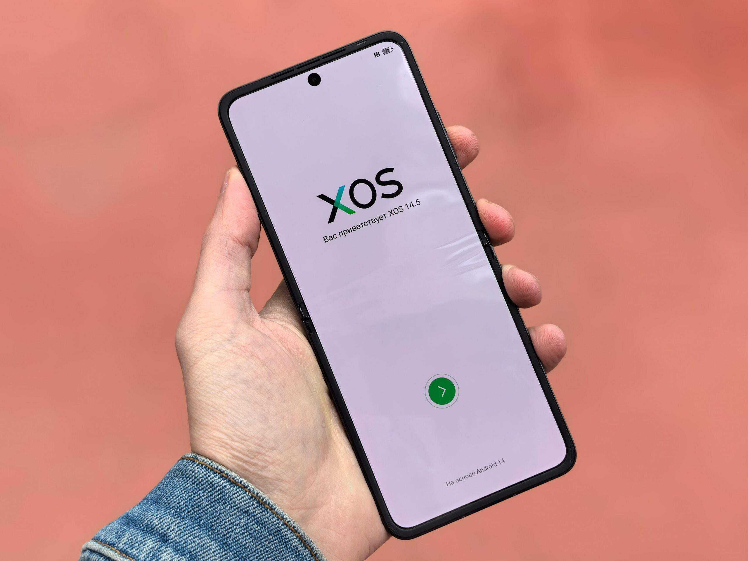
In 2026, the digital landscape is dominated by an unprecedented diversity of devices. From foldable smartphones with 7.6-inch screens to 49-inch ultrawide monitors, smartwatches, and even in-car dash displays, users access content through countless form factors. Google’s mobile-first indexing is now fully mature, meaning the mobile version of your site is the primary version used for ranking and indexing. Further, Core Web Vitals—specifically Largest Contentful Paint (LCP), First Input Delay (FID), and Cumulative Layout Shift (CLS)—remain critical ranking signals. A responsive site is no longer a luxury; it is a fundamental technical SEO requirement. Without it, you risk significant traffic loss, higher bounce rates, and diminished conversion potential.
The Core Principles of Modern Responsive Design
Responsive design in 2026 rests on three foundational pillars: fluid grids, flexible images, and CSS media queries. However, the implementation has evolved. Fluid grids now use CSS Grid and Flexbox almost exclusively, replacing older float-based layouts. The clamp() function allows for truly dynamic typography, adjusting font sizes proportionally without breakpoint dependency. For images, the element combined with srcset and sizes attributes ensures browsers download only the most appropriate file based on viewport width and pixel density. Media queries have shifted from targeting specific devices to targeting viewport ranges, using logical operators like @media (width >= 768px) for cleaner, more maintainable code. The modern approach emphasizes intrinsic design—where components adapt naturally to their container rather than rigidly to the viewport.
Beyond Mobile-First: The 2026 Device Landscape
The mobile-first approach remains valid, but the current landscape demands a more nuanced strategy. Consider these device categories:
- Foldable and Dual-Screen Devices: Samsung Galaxy Z Fold series, Microsoft Surface Duo, and Google Pixel Fold require special attention to continuity across seams and aspect ratio changes.
- Tablets in Portrait and Landscape: iPad Pro and Samsung Galaxy Tab users frequently switch orientations, demanding smooth transitions.
- Desktop with Variable Zoom and Accessibility: Users often zoom to 125% or 150%, making your layout’s resilience critical.
- Smart TVs and Gaming Consoles: Increasingly used for web browsing, these require huge viewports (1920px to 3840px) and focus on readability.
- Wearables: Smartwatches with web capabilities, though niche, demand ultra-condensed layouts.
Testing should cover each category. Tools like BrowserStack and Responsively App allow simultaneous preview across multiple form factors.
Mastering CSS Grid, Flexbox, and Container Queries
In 2026, container queries have become a game-changer. Unlike media queries, which respond to the viewport, container queries allow elements to respond to the size of their parent container. This enables truly modular design: a card component can reflow its layout based on how much space it has inside a sidebar versus a main content area. The syntax is simple:
.card-container {
  container-type: inline-size;
  container-name: card;
}
@container card (min-width: 400px) {
  .card {
    flex-direction: row;
  }
}
Use CSS Grid for two-dimensional layouts (rows and columns), and Flexbox for one-dimensional distribution. For grids, consider auto-fit and auto-fill with minmax() to create truly fluid columns without media queries:
.grid {
  display: grid;
  grid-template-columns: repeat(auto-fit, minmax(250px, 1fr));
  gap: 1rem;
}
This pattern ensures that as the viewport narrows, columns automatically collapse without manual breakpoints.
Typography, Images, and Media Optimization
Readability is the cornerstone of user experience. Use clamp() for font sizes:
font-size: clamp(1rem, 2.5vw, 1.5rem);This ensures a minimum size of 1rem, scales fluidly up to 1.5rem, and prevents text from becoming too small on narrow screens or too large on wide ones. For line height, a value of 1.5 is optimal for body text; for headings, 1.2 works well. Avoid fixed px values for font sizes; use rem or em.
For images, always implement lazy loading via loading="lazy" attribute. Use modern formats like WebP and AVIF, with JPEG/PNG fallbacks. The element allows art direction—cropping images differently for mobile and desktop:

For video, consider with multiple source formats and poster images. Autoplay with sound is universally discouraged; always respect user preferences.
Performance: The Hidden Pillar of Responsiveness
A responsive site that loads slowly is not truly responsive. Performance optimization directly impacts user experience and SEO. Key strategies for 2026:
- Optimize Core Web Vitals: LCP should be under 2.5 seconds. Use preload hints for hero images and critical CSS. Consider using a Content Delivery Network (CDN) and preconnect to third-party origins.
- Reduce CLS (Cumulative Layout Shift): Always set explicit width and height attributes on images and videos. Use
aspect-ratioin CSS to reserve space before media loads. For fonts, usefont-display: swapto prevent invisible text and layout shifts. - Minimize JavaScript: Defer non-critical scripts using
deferorasync. Consider usingIntersection Observerfor lazy-loading elements. In 2026, many interactions can be handled purely with CSS (e.g.,:has()selector,@starting-style). - Efficiently load fonts: Use
font-display: optionalfor icons or non-essential fonts. Subset fonts to remove unnecessary glyphs. Use variable fonts (one file for multiple weights) to save bandwidth.
Accessibility and Usability for All Devices
Responsiveness and accessibility are inseparable. A site that reflows but loses keyboard navigation or contrast is failing users. Follow WCAG 2.2 guidelines:
- Touch targets: On mobile, ensure interactive elements are at least 48×48 CSS pixels, with sufficient spacing.
- Focus indicators: Use
:focus-visibleto provide clear outlines for keyboard users without visual clutter for mouse users. - Scalable text: Avoid disabling user zoom (
user-scalable=nois forbidden in modern accessibility audits). - Legible line lengths: Aim for 45–75 characters per line; use
chunits for container max-widths. - Responsive tables: Convert wide data tables into cards or scrollable containers on narrow viewports. Use
role="rowgroup"and ARIA labels for clarity.
Testing and QA: From Emulators to Real Devices
No amount of theory replaces rigorous testing. Your QA pipeline should include:
- Browser DevTools: Simulate mobile, tablet, and desktop with device emulation in Chrome, Firefox, and Safari.
- Real Device Testing: Use services like BrowserStack, Sauce Labs, or maintain a physical device lab covering iOS (iPhone SE, 14 Pro, 16 Pro Max), Android (Samsung Galaxy S24, Fold 5, Pixel 8), and tablets (iPad, Surface Pro).
- Network Throttling: Test under 3G, 4G, and offline conditions using Chrome DevTools network throttling.
- Automated Testing: Integrate Lighthouse CI into your deployment pipeline. Set budgets for performance, accessibility, and SEO scores.
- Accessibility Audits: Use axe-core, WAVE, or Lighthouse’s accessibility section. Test with screen readers (VoiceOver, NVDA, TalkBack).
SEO Implications of Responsive Design
Responsiveness directly influences SEO. Google’s algorithm favors mobile-friendly sites. Specific factors:
- Separate mobile URLs (m.domain.com) are deprecated. Google recommends responsive design as the single URL pattern. If you still use dynamic serving or separate URLs, migration is urgent.
- Page speed is a ranking factor. Responsive images (via
srcset), efficient CSS, and minimized JavaScript reduce server requests and load times. - Structured data must be consistent across viewports. If your mobile version omits schema markup present on desktop, you lose rich results.
- Canonical URLs must point to the mobile version. With mobile-first indexing, Google primarily crawls the mobile page. Ensure your sitemaps reflect the mobile experience.
- Navigate with caution: Avoid hidden content on mobile. Google may treat content hidden behind accordions or tabs as lower priority. Use progressive disclosure thoughtfully.
Common Pitfalls and How to Avoid Them
Even experienced developers make mistakes. Watch for these:
- Over-reliance on frameworks: Bootstrap or Tailwind can speed development but often produce bloated HTML. Custom CSS is leaner and more maintainable.
- Neglecting landscape orientation: Test both portrait and landscape. Many users rotate their phones without thinking.
- Fixed height containers: Heights that don’t accommodate variable text length cause overflow. Use
min-heightinstead. - Horizontal overflow: Any element wider than the viewport creates a scrollbar. Use
overflow-x: hiddenonly as a last resort; fix the root cause. - Ignoring print styles: Some users still print web pages. Provide
@media printstyles to remove navigation, ads, and backgrounds. - Not using relative units: Using
vwfor everything can break spacing on very small or very large screens. Mixrem,%, andclamp().
The Future: Responsiveness in 2026 and Beyond
As 2026 progresses, watch for these emerging trends:
- Subgrid: CSS
subgridallows nested grid items to align with the parent grid, enabling perfectly aligned cards across different content lengths. - Anchor positioning: The
anchor-nameandposition-anchorproperties will allow popups and tooltips to dynamically position themselves relative to any element, regardless of viewport. - Reactive animations: CSS
@scroll-timelineandview-timelinewill enable animations tied to scroll progress, but must be designed to degrade gracefully on unsupported browsers. - AI-driven adaptive design: Tools like Generative AI will soon help create responsive variants automatically based on user behavior data. This is experimental but worth monitoring.
- Progressive Web Apps (PWAs): A responsive PWA can be installed on any device’s home screen. Ensure manifest files and service workers are correctly configured.