Mastering Figma: A Complete UX Design Guide

Setting Up Your Figma Workspace for Optimal UX Workflow
Efficient UX design begins with a properly configured workspace. Start by enabling Auto Layout as your default frame behavior—this ensures responsive elements that adapt to content changes. Navigate to Preferences > Nudge Amount and set increments to 8px for desktop and 4px for mobile, aligning with the 8pt grid system widely adopted in industry-standard design systems.
Organize your Component Library by creating a dedicated team project for design tokens. Use Variables (available in Figma’s advanced plan) to store color, spacing, and typography values. This centralizes changes: updating a primary color variable instantly propagates across all components. For typography, define Text Styles using modular scales (e.g., 1.25 ratio) to maintain hierarchical consistency.
Leverage Plugins to automate repetitive tasks. Measure provides precise spacing annotations, Content Reel populates real text and images, and Unsplash integrates stock photography directly. Disable unused plugins to maintain performance—Figma’s browser-based architecture can slow with excessive active plugins.
Mastering Auto Layout: The Foundation of Responsive UX
Auto Layout transforms static frames into dynamic, responsive containers. Apply it to any group or frame by selecting the element and pressing Shift + A. Configure Padding (inner spacing) and Gap (between items) using the same 8px increments. Set Horizontal resizing to “Fill container” for buttons and “Hug contents” for text labels.
For complex layouts, nest Auto Layout frames hierarchically. A card component, for example, should have a parent frame with vertical Auto Layout, containing an image (with fixed aspect ratio), a text block (with “Hug contents” height), and a button (with “Fill container” width). This structure automatically adjusts when you swap images or edit copy.
Use Absolute positioning sparingly—only for elements that require precise placement within a responsive frame, such as badges or icons overlaid on images. All other layout decisions should flow through Auto Layout’s constraints. Test responsiveness by resizing frames using the Prototype preview or the Responsive Resize feature, which simulates different viewports.
Component Architecture: Building Scalable Design Systems
Components are the backbone of consistent UX. Create Master Components for all UI elements—buttons, input fields, navigation bars, and cards. Each component should include Properties (variants, swap instances, and text overrides) to maximize reusability.
Organize components using Variants: a button component might include Primary, Secondary, Disabled, and Loading states. Use the Component Properties Panel to add boolean toggles (e.g., “Show icon”) or text overrides. This reduces component clutter—designers can access all button variations from a single master component rather than separate files.
Establish Component Naming Conventions using slash notation (e.g., “Buttons/Primary/Default”). This creates automatic grouping in the Assets panel. Use Descendant Components for nested elements: a card component can contain a button component that inherits its parent’s styling but remains editable locally.
Detach instances only when absolutely necessary—every detached component breaks the design system’s synergy. Instead, use Override properties for one-off changes, and periodically audit your Library to clean up unused components.
Prototyping and Interaction Design in Figma
Figma’s prototyping capabilities enable high-fidelity interactions without coding. Begin by defining Frames for each screen state. Use Smart Animate for smooth transitions between frames that share similar element structures. This mimics real-world motion: for a dropdown, animate the opacity and height simultaneously.
Set Triggers (On Click, While Hovering, While Dragging) to map user actions. For mobile prototypes, prioritize Gesture-based interactions: “Swipe left” for navigation drawers, “Pinch” for image zoom. Use Overlay for modals and tooltips—configure the overlay’s position and background dimming to match UX best practices.
Overflow scrolling is critical for content-heavy screens. Enable it on long frames and set Scrolling position to “Show scrollbar” during prototyping. For interactive forms, use Text input fields with placeholder text and validation states visible in the prototype.
Leverage Variable-based prototyping (in beta) to create conditional flows. For example, store user login status as a variable, then show or hide dashboard elements based on its value. This reduces the number of frames needed for state-driven interfaces.
Collaboration and Handoff for Seamless Development
Figma’s collaborative features streamline designer-developer handoff. Use Figma Dev Mode (available in paid plans) to present designs to developers with automatic code generation for CSS, SwiftUI, and Android XML. Include Annotations for complex interactions—right-click frames and select “Add description” to explain animation timing or breakpoints.
Maintain a Version History by naming iterations clearly (e.g., “v2.3 Login Flow Refined”). Use Branches for experimental features, merging only when approved. For team collaboration, implement Team Libraries with permissions: restrict editing to senior designers while allowing junior designers to use components without modification rights.
Feedback should flow through comments attached to specific layers. Use the @mention feature to notify stakeholders. For accessibility, attach Alt text to images and icons—this exports to design specs and aids developers in implementing ARIA labels.
Advanced Techniques: Design Tokens and Theming
Design tokens turn static designs into scalable systems. In Figma, create Local Variables for colors, spacing, font sizes, and radii. Group them by theme (Light, Dark) using collections. For example, define “Color/Surface/Primary” with a light mode value of #FFFFFF and dark mode #121212.
Dark mode theming requires two variable collections. Use Variable Modes to switch between them—select a frame, then toggle the mode from the Properties panel. All components using those variables update instantly. This approach reduces the need for duplicate files and manual color adjustments.
Typography tokens should include family, weight, line height, and letter spacing. Avoid hardcoding these—link text styles to variables for consistent scaling. For responsive typography, use clamp() functions when exporting to CSS, ensuring text scales smoothly between breakpoints.
Accessibility and Inclusive Design in Figma
Accessible UX begins in design. Use Axe for Designers plugin to scan for common violations: insufficient color contrast, missing labels, and small touch targets. Set minimum contrast ratios—4.5:1 for normal text, 3:1 for large text (18px+ bold, 24px+ regular). Use Colorblind-friendly palettes from plugins like Stark.
Test focus states by creating hidden frames showing keyboard navigation outlines. For touch targets, ensure interactive elements are at least 44x44px. Use Figma’s overrides to add aria-label descriptors to components—these export to developers as accessibility attributes.
Semantic structure matters: organize layers in the same order they appear in a screen reader. Group elements logically, and use Instance swapping to maintain accessible fallbacks for icons without visible labels.
Performance Optimization for Large Figma Files
Large design files degrade performance. Optimize by limiting image size—use lossy compression (e.g., JPEG at 80% quality) for backgrounds and screenshot mockups. Vectorize icons and simple graphics; avoid importing high-resolution raster images.
Purge unused styles and components using the Components Dashboard or third-party plugins like Remove Unused. Fragment large files into separate Figma files for each feature or workflow, linked via Inter-file components (from Team Libraries). This prevents a single file from becoming unmanageable.
Enable “Outline view” when navigating complex component trees—this renders all layers as outlines, reducing rendering overhead. For prototyping, limit animation length to under 3 seconds and use Fixed positioning sparingly.
Final Practical Workflow: From Wireframe to High-Fidelity Prototype
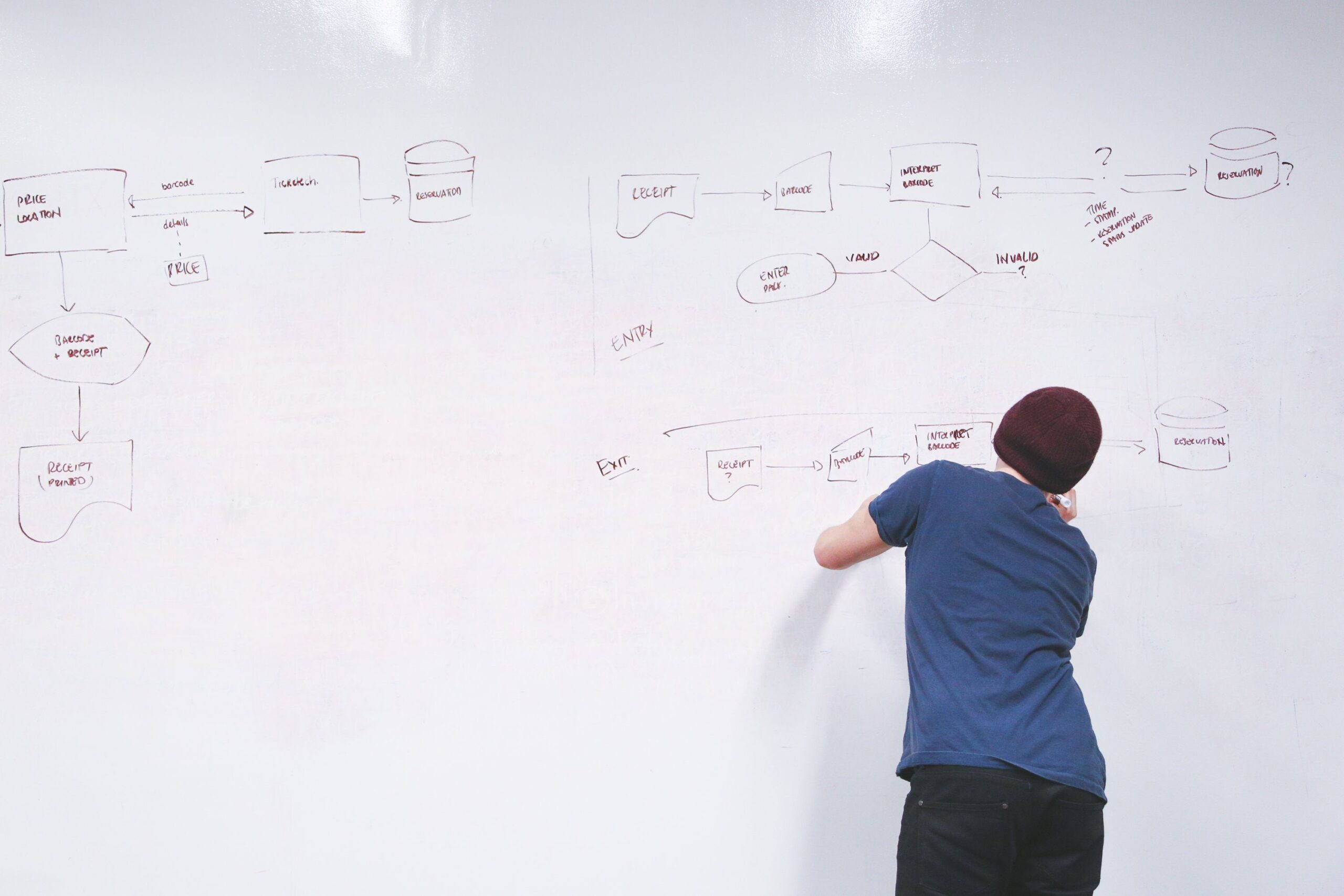
A structured workflow maintains design momentum. Start with Low-fidelity wireframes using Stickies and basic rectangles—focus on user flows, not aesthetics. Use Figma’s Flowchart Plugin to map navigation paths.
Transition to Mid-fidelity by applying Auto Layout to wireframes and linking components from the library. Add real content (text, placeholder images) to test information hierarchy. Use Layout grids with 12 columns for desktop, 8 for tablet, and 4 for mobile.
High-fidelity involves applying design tokens, refining typography, and adding micro-interactions via prototypes. Use Interactive components for hover states and toggle animations. Finally, hand off via Dev Mode with annotations, exported assets, and code snippets.
Consistency is achieved through disciplined use of components, variables, and Auto Layout. The time invested in building a robust system returns exponentially as projects scale.